

Expert Guide to Painting Black: Techniques & Tips for 2026
Struggling to make your blacks look deep, dynamic, and realistic? You are not alone. Many artists find painting black to be one of the most challenging skills to master, often fearing flat or muddy results.
This expert guide is here to demystify painting black, sharing advanced techniques, essential tips, and the very latest strategies for 2026. Whether you are an artist, hobbyist, or seasoned professional, you will gain actionable knowledge to achieve true depth, realism, and vibrancy every time you paint.
Inside, you will explore colour theory, discover the best materials, learn about surface preparation, and follow step-by-step methods to perfect your approach. Along the way, you will find solutions to common problems and discover innovative trends shaping the future of painting black.
Ready to unlock the secrets and transform your skills? Read on and bring your black finishes to life.
Understanding the Complexity of Painting Black
Ever tried painting black and wondered why it never looks quite right on your canvas or miniature? You’re not alone. Mastering painting black is a notorious challenge, even for seasoned artists. It’s more than just reaching for the nearest tube of black paint. To create depth, realism, and a sense of life, you need to understand how black behaves—both scientifically and artistically.
Let’s unravel what makes painting black such a fascinating puzzle, and why it’s a skill worth honing.
The Science and Perception of Black
Did you know the human eye struggles to distinguish subtle shifts within dark colours? When you’re painting black, this limitation means it’s easy for your work to look flat or lifeless unless you’re intentional with your approach.
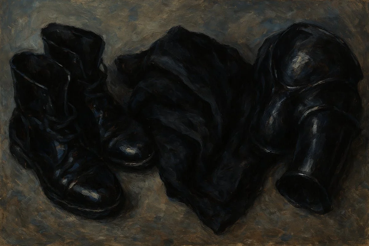
Technically, black is the absence of light. But in the real world, very few things are truly black. Surfaces almost always reflect a hint of colour, whether it’s blue from a cold window or brown from warm indoor lighting. This is why a piece of black cloth looks different from black metal or plastic, even under the same light.
Let’s break it down with a quick comparison:
Material Typical Undertone Surface Reflection
Black Cloth Blue/Grey Matte, absorbs light
Black Metal Blue/Brown Shiny, sharp highlights
Black Plastic Neutral/Brown Semi-gloss, subtle reflection
Understanding these differences is crucial for painting black convincingly. Professional artists agree that no surface is a “pure” black. Instead, what we perceive as black is always influenced by the environment and the object’s material.
If you simply apply black paint, you risk losing all sense of depth. The secret is to control contrast and introduce subtle undertones. For instance, adding a hint of blue can make black feel cooler and more lifelike, while brown can introduce warmth.
It’s tempting to use bright highlights to make details pop, but go too far and your black turns grey or washed out. The magic of painting black lies in these subtle shifts, not in dramatic jumps.
If you’re curious to see how artists have explored these ideas, you might enjoy The Colour in Black and White, which dives deeper into how black is never just one note in art.
Colour Theory and Black
Let’s dig into colour theory—your best friend when painting black. Not all blacks are created equal. There’s a world of difference between warm and cool blacks, and knowing how to mix and use them is a game-changer.
A warm black, made by mixing ultramarine blue and burnt umber, is perfect for painting black fabrics that need to feel rich and natural. A cool black, perhaps with more blue or even a touch of green, is ideal for ghostly or night-themed effects. This choice can completely change the mood of your piece.
Here’s a quick tip: Avoid using pure black as your base. Most artists prefer to mix their own, controlling the undertones to fit their subject. This custom approach lets you adapt painting black to whatever you’re working on, from miniatures to large canvases.
Neighbouring colours also play a huge role. If your black object sits next to something red, a subtle red undertone in your black will help everything feel cohesive. If it’s under moonlight, lean into cool, blue-infused blacks.
Consider this: When painting Nazgul robes, artists often use a warm black to mimic the depth of layered cloth, while for a vampire’s cloak, a cool black creates an eerie, lifeless vibe. The trick is to let the context guide your mix.
Data from artist surveys shows that most avoid using black straight from the tube, instead preferring to blend for a unique finish. By understanding these principles, you’ll start seeing painting black as a creative opportunity rather than a hurdle.
Essential Materials and Tools for Painting Black
If you want to master painting black, the right materials make all the difference. Many artists overlook just how much impact your choice of paint, brushes, and surface prep has on the final result. Let’s break down what you really need to get those deep, dynamic blacks.
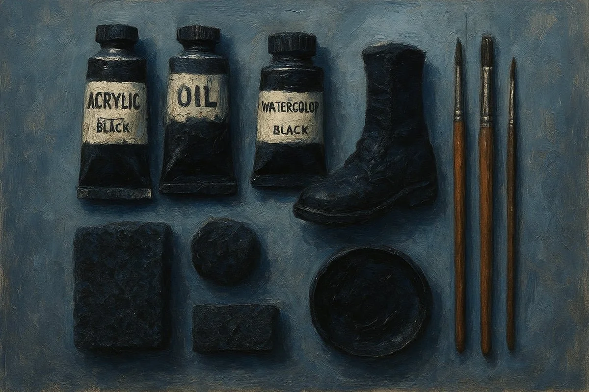
Choosing the Right Paints and Mediums
Not all paints labelled “black” are created equal. When painting black, you’ll notice acrylics dry fast and are ideal for miniatures, whereas oils offer more time for blending and richer transitions. Watercolours give delicate, transparent effects but require more control.
Paint Type Pros Cons
Acrylic Fast drying, easy layering Can dry too quickly
Oil Long blending time, smooth gradients Slow drying, needs solvents
Watercolour Subtle washes, luminous blacks Less forgiving, stains
Different brands offer unique black shades. For example, some artists prefer Reaper Pure Black for its opacity, while others like Vallejo’s softer undertones. Matte paints suit cloth and organic textures, while gloss paints are perfect for shiny leather or armour. Additives like flow improvers or retarders can help when painting black, giving you more control over blends.
If you’re interested in mixing your own black, check out Mixing Black Paint Techniques for tips on combining colours to get custom undertones and depth.
Brushes and Application Tools
Smooth, realistic painting black finishes rely on high-quality brushes. Use fine-tipped detail brushes for sharp edges and transitions. For advanced effects, try specialty tools:
Sponges for soft, mottled textures
Stippling brushes for organic patterns
Airbrushes for ultra-smooth gradients
A wet palette is a game-changer for blending, especially with acrylics. Dry palettes are handy for stippling and controlled paint loading. Remember, the right tool can give your painting black surface the finish you want, whether it’s satin, matte, or glossy.
Surface Preparation and Priming
Surface prep is your secret weapon in painting black. Priming with a medium or dark grey gives you more control over shadows and highlights. A black primer can make details vanish, while white can make blacks look washed out.
Always sand and smooth your surfaces to avoid rough patches that catch too much light. For miniatures like boots, cloaks, or armour, a well-prepped surface leads to even paint application and richer black tones. The better your prep, the more convincing your painting black results will be.
Step-by-Step Techniques for Painting Black (2026 Edition)
Ready to breathe life into your next masterpiece? Mastering painting black is all about understanding process, light, and subtlety. Let’s break it down, step by step, so you can confidently tackle any black surface, whether you’re working on miniatures, canvas, or any other medium.
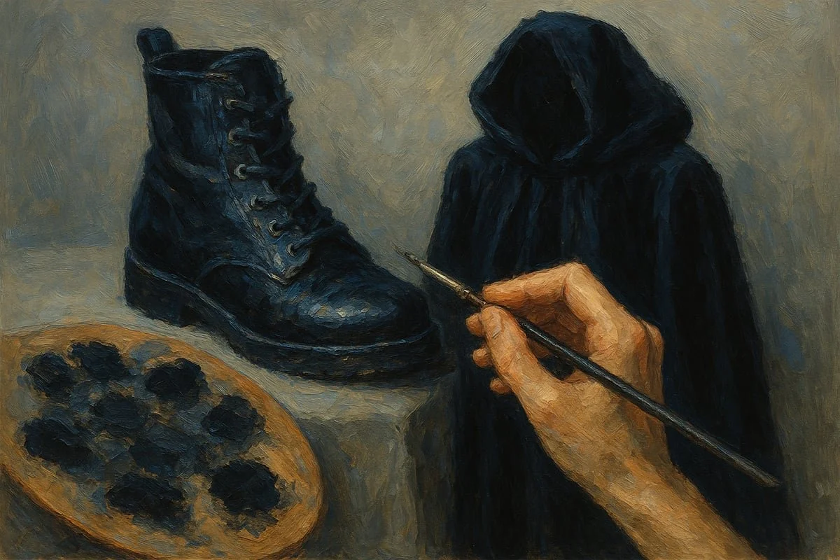
Step 1: Selecting and Mixing Your Base Black
The foundation of painting black is choosing the right base. Pure black straight from the tube often looks flat and lifeless. Instead, start with a near-black mixed from complementary colours. For example, combine ultramarine blue and burnt umber to create a deep, custom black. This approach lets you control undertones for different materials.
Think about the object’s context. Warm blacks, made with more brown, are perfect for fabrics and skin tones. Cool blacks, using more blue, suit night scenes or metallic objects. Swapping out a neutral grey for a blue-grey or brown-grey can transform the mood.
Before you start painting black, test your mix on a scrap piece or palette. Adjust until you see subtle depth when dry. This is your base for all further steps.
Step 2: Mapping Out Light and Reflection
The next step in painting black is to plan your lighting. Light and reflection define how black reads to the eye. Begin by sketching your highlight areas with a light pencil or thin paint. Visualise where the light will hit—think about the angle and type of surface.
For shiny blacks, like patent leather or wet hair, highlights are sharper and more concentrated. For matte surfaces, highlights are broader and softer. The physics of light means reflection points are rarely at the very top; they often sit just below the zenith, especially on curved shapes.
Try marking out highlight zones before you start blending. Use reference photos or real objects to study how black surfaces interact with light. This planning is crucial for realistic painting black results, especially on complex forms.
Step 3: Layering and Blending for Depth
Now it’s time to bring your painting black to life with layers. Begin by applying your mixed base black, then gradually introduce mid-tones and highlights. Use thin layers and build up slowly. Feathering and stippling are great techniques for seamless gradients.
When blending, always work from light to dark. This avoids harsh transitions that can make black look chalky. Glazes—thin, transparent layers—are your secret weapon. They unify transitions without dulling the shine or depth.
For example, painting black boots might involve blending Dark Elf Highlight, Vampiric Shadow, and Pure Black in overlapping layers. If you want more process insight, check out Behind the Scenes: How One Painting Comes to Life for a practical look at real painting techniques.
Step 4: Adding Highlights and Final Touches
Highlights are the make-or-break moment in painting black. Use restraint. Too much highlight turns black to grey. For hard, shiny surfaces like armour or patent boots, use a pinpoint of off-white or very light grey for the brightest spot. Apply sparingly, often just a dot or thin line.
On fabrics or organic materials, opt for soft, gradual highlights. Blend them in gently so the transition feels natural. Always keep the area of highlight small compared to the shadow.
A helpful trick is to step back and squint at your work. If the highlights pop without overwhelming the surface, you’re on track. Remember, painting black is about subtlety and control, not just contrast.
Step 5: Adjusting and Correcting
Once your highlights are in place, review your painting black from a distance. Does it look deep and realistic, or are there harsh lines? If you spot over-highlighted areas, glaze over them with your base black mix to restore depth.
For rough transitions, stippling or feathering with a nearly dry brush can soften edges. Don’t hesitate to correct mistakes—painting black is a process of refinement.
Finally, compare your black areas to the rest of your piece. Cohesion is key. Adjust as needed so your blacks harmonise with the overall colour scheme and lighting. With practice, these techniques will become second nature, elevating every project you tackle.
Advanced Tips for Painting Different Black Surfaces
Mastering painting black across different materials can be a real adventure, can’t it? Each surface, from shining boots to velvety cloaks, demands its own approach. Let’s break down how you can make your black surfaces look realistic, lively, and full of depth—no matter what you’re painting.
Painting Shiny Black (Glossy Effects)
When it comes to painting black with a glossy finish, less is more. The trick is to create the illusion of shine using contrast, not just gloss paint. Start by mapping out where the strongest reflections would naturally fall. Think about shiny leather boots or slick black hair—these surfaces catch sharp, bright highlights.
Use a near-black base, then add tiny, crisp highlights with off-white or very light grey. Keep these highlights small and focused, as overdoing them can make things look grey instead of black. Softly blend the edges of your highlights into the base to avoid harsh lines.
Try layering a touch of gloss medium over your finished highlights for extra punch. With painting black, remember, the real magic is in controlling contrast and reflection.
Painting Matte Black (Soft and Subtle)
Painting black in a matte style is all about subtlety. Unlike shiny surfaces, matte blacks rely on soft, diffused light. When you’re painting black cloth or drapery, keep your highlights gentle and broad. Avoid using pure white for highlights—opt for a soft grey or a touch of blue or brown for a more natural effect.
Work in thin, semi-transparent layers, gradually building up lightness. Use feathering or gentle stippling to blend transitions. Matte black should never feel flat, so add a hint of warmth or coolness depending on your scene. This approach to painting black helps fabrics look plush and realistic, whether you’re painting a wizard’s cloak or a modern jacket.
Weathering and Texturing Black
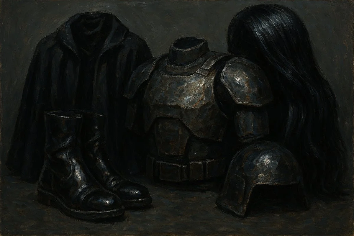
Want your painted black surfaces to tell a story? Weathering and texturing are your tools. Realistic painting black often means adding wear, dust, and subtle colour shifts. For worn leather or battered armour, introduce browns, blues, or greys into your highlights and shadows.
Edge highlights in a warm or cool grey can simulate scuffs or worn spots. Use a sponge or drybrush to dab on texture, mimicking dust or chipped paint. For inspiration, check out Colour Trends in Art 2026, which explores how artists use texture and contrast for modern, dynamic effects. This approach makes painting black feel alive and true to the real world.
Black on Different Materials
Painting black changes a lot depending on what you’re working with. Black metal, for instance, needs sharper, colder highlights to suggest its reflective nature. Plastics often look better with smoother, softer transitions, while fabrics call for muted, blended highlights to capture their absorbent quality.
Here’s a quick table to summarise:
Material Highlight Colour Technique
Metal Cool grey/blue Sharp, small spots
Plastic Neutral grey Soft blends
Fabric Warm/cool grey Broad, subtle areas
Organic Warm brown/grey Feathered edges
Matching your approach to the material is vital for painting black that feels convincing.
Incorporating Environmental Effects
Think about how your painting black surfaces interact with the world around them. Is your model under moonlight, firelight, or studio lamps? The colour and direction of the light can dramatically change how black appears. Painting black in moonlight might mean cooler, bluish highlights, while firelight calls for touches of warm orange or brown.
Glazing with thin washes in environmental colours can tie your blacks into the scene. Always step back and check how your black surfaces fit with the rest of your composition. Adjust highlights and undertones as needed to keep everything cohesive. This attention to environmental context is what takes painting black from good to truly stunning.
Common Mistakes and How to Avoid Them
Have you ever finished a piece only to find your black areas look flat or unnatural? When painting black, it is surprisingly easy to fall into a few common traps. Recognising and correcting these mistakes can make all the difference between a dull finish and a striking, realistic result.
Over-Highlighting Turns Black Grey
One of the biggest mistakes in painting black is going overboard with highlights. Too much highlighting, especially using pure white, quickly shifts your black into a muddy grey. This happens when you cover too much surface or use highlights that are too bright. Instead, keep highlights sharp and minimal. Focus them on the most reflective points or edges, letting most of the black stay deep and rich.
Using Pure Black as a Mid-Tone Flattens Depth
Another easy pitfall is treating pure black as your main mid-tone. If you lay down solid black and expect to build depth from there, you will often find your results look lifeless. Realistic painting black involves mixing in undertones, like subtle blues or browns. This adds visual interest and prevents the painted area from looking like a black hole. Try starting with a near-black and layering up, rather than reaching for the purest black straight away.
Ignoring Material and Light Source
You might notice your painting black does not look right if you forget about the material or lighting. A black leather boot reflects light differently from a black wool cloak. Similarly, painting black under cool moonlight will look different than under warm candlelight. Take the time to study your reference or model before you start. Adjust your highlights and undertones to fit the specific material and lighting in your scene.
Poor Blending and Harsh Transitions
Rough, unblended transitions are another issue that plagues painting black. Because black is such a strong colour, any harsh shift between shades tends to stand out. If your transitions are too sudden, the result is a patchy or streaky look. Use feathering, glazing, or stippling to smooth those transitions. Wet palettes can help you blend more gradually, especially on small surfaces.
Highlights Placed Too Broadly or Sharply
Placing highlights incorrectly is a subtle but common mistake. If you spread highlights too broadly, the black loses its richness. If you make highlights too sharp on soft materials, the effect becomes unnatural. Instead, study where light naturally hits the object and limit your highlight area. For hard, shiny surfaces, go for small, crisp highlights. For fabrics, keep them soft and blended.
Context: Matching Black Tones to the Whole Piece
A final mistake is forgetting to match your painted blacks to the rest of your model or artwork. If your black is too cool next to a warm-toned scene, or too matte when everything else is glossy, it jars the eye. Compare your blacks with surrounding colours and adjust as needed. Many artists, as shared in Sharing My Art: The Creative Journey, discover this through trial and error, adjusting their approach as they develop their style.
Here is a quick table to help you spot and fix these mistakes:
Mistake Quick Fix
Over-highlighting Use fewer, sharper highlights
Pure black as mid-tone Mix in undertones for depth
Ignoring material and light Study references and adjust colour/placement
Poor blending Use glazing, feathering, or stippling
Incorrect highlight placement/context Match highlights to material and scene
By being mindful of these common pitfalls, you will find painting black becomes far more rewarding, and your results will look deeper and more convincing.
Innovations and Trends in Painting Black for 2026
Staying ahead in painting black means keeping up with the latest innovations and artistic shifts. If you want your work to look modern and vibrant, it pays to know what new tools, paints, and ideas are changing the way artists approach black. Let’s dive into what’s shaping the world of painting black in 2026.
New Paint Formulations and Tools
The world of painting black is evolving fast thanks to advances in pigment technology. Modern black paints are richer, more dynamic, and far more versatile than ever before. You can now find ultra-matte blacks that almost swallow light, colour-shifting blacks that reveal undertones as the angle changes, and high-gloss options that mimic polished obsidian.
What’s behind these new paints? Scientists are using novel pigments and binders to enhance depth and coverage. For artists looking to push boundaries, digital tools are now available too. Colour analysis apps help you plan undertones and highlights, making the process of painting black more precise and less intimidating. If you’re curious about the science, the Non-invasive Identification of Black Pigments provides fascinating insights into the composition and application of modern black pigments.
Let’s compare some current options:
Paint Type Finish Best Use
Ultra-matte black Flat Cloaks, shadows
High-gloss black Reflective Armour, patent boots
Colour-shifting Dynamic Special effects
With these innovations, painting black is more exciting, and you have the tools to make every surface pop.
Influences from Contemporary Art and Design
Art trends in 2026 are bringing fresh life to painting black. Artists aren’t just using black for shadows or outlines anymore. Instead, black is front and centre, used to evoke emotion, contrast, and drama. Abstract and contemporary artists are experimenting with bold black textures, layering, and even incorporating non-traditional materials.
Why is this shift happening? There’s a growing appreciation for the power of black as a statement colour. When you explore the emotional and visual impact of black, you’ll see how it can change the mood of a piece. For a deeper understanding, check out The Colours of Music, which explores how colour choices, including black, shape perception and depth in art.
By embracing these trends, you can use painting black to create work that feels modern and emotionally charged. Try layering thick impasto black or blending in subtle undertones for extra depth.
Community Insights and Expert Recommendations
One of the best ways to master painting black is to learn from the community. In 2026, artists are sharing tips and breakthroughs online more than ever before. Forums, social media groups, and digital workshops are packed with advice on how to achieve the richest blacks and most convincing highlights.
Top miniature and fine artists recommend experimenting with new paint formulations, but they also stress the basics: control your highlights, mix your blacks for the right undertone, and always adjust for the lighting in your scene. Case studies of award-winning miniatures and canvases show that subtlety in painting black often wins over harsh contrast.
If you’re serious about improving, join online challenges or participate in critiques. You’ll pick up on the latest methods and maybe even get inspired to try something new with your own painting black projects.
Sustainability and Eco-Friendly Practices
Sustainability is taking centre stage in painting black for 2026. Many artists are choosing eco-conscious brands that offer non-toxic black pigments and recyclable packaging. The push for greener practices doesn’t stop at paint selection, though. You can also minimise waste by using wet palettes, cleaning brushes efficiently, and safely disposing of leftover pigments.
Why make the switch? Sustainable choices help protect the environment and create a safer studio space for you. As more brands innovate, expect to see even more eco-friendly options tailored for painting black, so you can create stunning work without compromise.
Frequently Asked Questions About Painting Black
Painting black can feel like a puzzle, can’t it? Many artists hit roadblocks when trying to achieve depth, vibrancy, or realism. Here are answers to the most common questions about painting black, so you can unlock its full potential in your own work.
How do you prevent black from looking flat?
The secret to painting black with life is all about contrast and subtle undertones. If your black looks flat, try mixing in a touch of blue, brown, or grey to create a custom base. Then, add highlights sparingly in the areas that catch the most light. Always step back and check your piece from a distance. This helps you spot areas that need more depth.
What are the best highlight colours for black?
Choosing the right highlight colour depends on the material and lighting. For a neutral, realistic effect, use dark greys. Want to warm things up? Add a hint of brown or red to your highlight mix. For cool, night-time effects, try blue-greys. Here’s a quick table for reference:
Surface Highlight Colour
Cloth Warm grey, soft white
Leather Brownish grey, off-white
Metal/Armour Blue-grey, pure white (tiny spots)
If you’re curious about how undertones affect highlight choices, the Colour Theory Workshop Materials provide excellent guidance on mixing warm and cool shades.
How can you make black look realistic on different materials?
Painting black convincingly means thinking about the surface you’re painting. For shiny objects like boots or hair, keep highlights sharp and small. For soft cloth, blend highlights gently, spreading them out more. Adjust your undertones too: use brown for warmth, blue for coolness. Remember, painting black on plastic or metal needs a different approach than on fabric. Observe real objects for inspiration.
What is the best way to blend black transitions?
Blending is key in painting black, especially since harsh lines can ruin the illusion. Use thin layers and feather your brush strokes. Wet blending, glazing, or stippling can help you achieve seamless transitions. Patience is your friend here—multiple light coats work better than one heavy application.
Should you ever use pure black straight from the tube?
Pure black is rarely used as a base in painting black. It tends to look unnatural and blocks out subtlety. Mix your own black using complementary colours, or add a touch of another pigment to tube black for richer results. Save pure black for deep shadow spots or the darkest accents.
How do you fix mistakes when painting black?
Everyone slips up! If you over-highlight and things look grey, glaze over the area with a thinned-down black mix to restore depth. For harsh transitions, try stippling or feathering the edges. Don’t be afraid to layer and adjust until you’re happy with the effect.
Are there differences between painting black for miniatures versus canvas art?
Yes, the scale changes everything. On miniatures, highlights and shadows need to be exaggerated for the eye to read them properly. On canvas, you can go for more subtlety and fine blending. Still, the core principles of painting black—contrast, undertones, and highlight placement—apply to both.
When should you use gloss vs. matte finishes for black surfaces?
Think about the material you’re representing. Use gloss varnish or paint for shiny leather, wet hair, or polished armour. Matte finishes work best for cloth, skin, or stone. Mixing both can add realism to a single piece, like a character with both glossy boots and a matte cloak.
Painting black is all about learning how light, colour, and material interact. Try out these tips and don’t be afraid to experiment. Your blacks will look richer and more dynamic with every project.
So, after exploring all these insider techniques and fresh trends for painting black, you might be itching to try them out on your own art. Or maybe you just want to see how these ideas come to life in real, contemporary pieces—sometimes that’s the best way to spark your next creative leap, isn’t it? At Spirit Glow Art®, you’ll find artworks and prints that play with depth, emotion, and even a bit of cheeky humour—exactly the kind of inspiration you need after diving into the art of painting black. Fancy seeing how these techniques look in action? Explore now