

Colour for Artists Guide: Mastering Hues in 2026
Colour has always been at the heart of artistic expression, but in 2026, its role has never been more dynamic. For those exploring colour for artists, the possibilities are expanding with groundbreaking pigments, digital innovation, and inspiration from around the world.
As an artist, you now have more creative freedom than ever before. This guide is here to help you master hues, harness the science of colour theory, and unlock advanced techniques for truly impactful art.
You will discover the foundations of colour theory, explore the latest trends, learn practical mixing strategies, and see how psychological effects and real-world applications can transform your work. Ready to elevate your art with colour? Let’s dive in.
The Foundations of Colour Theory for Artists
Colour for artists is much more than just picking a shade you like. If you want your art to pop in 2026, mastering the basics of colour theory is essential. Whether you’re painting portraits or experimenting with digital media, these foundations will unlock new creativity in your work.
Understanding the Colour Wheel and Its Structure
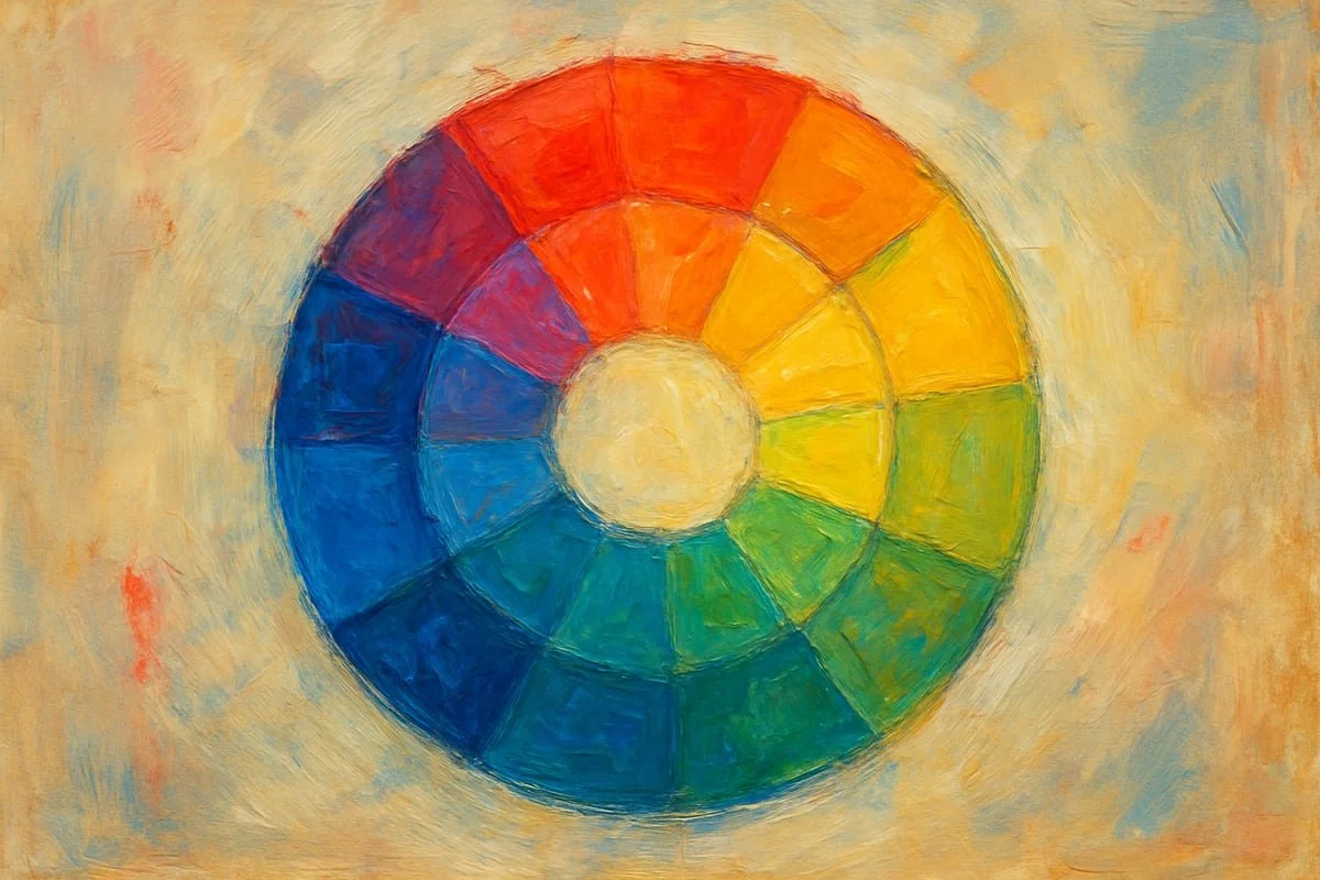
Let’s start with the backbone of colour for artists: the colour wheel. First introduced by Isaac Newton in the 18th century, the wheel has evolved to guide generations of creatives. Today’s standard 12-hue wheel features primary colours (red, yellow, blue), secondary colours (orange, green, violet), and tertiary colours (like yellow-green or blue-violet).
Think of the wheel as a roadmap for mixing and selecting colours. Hue (the actual colour), saturation (intensity), and value (lightness or darkness) are the three pillars you’ll use constantly.
Here’s a simple table to visualise the structure:
Colour Type Examples
Primary Red, Yellow, Blue
Secondary Orange, Green, Violet
Tertiary Red-Orange, Blue-Green, Yellow-Green, etc.
Mastering the wheel is the first step in colour for artists. If you’d like a deeper dive, check out the Color Theory Workshop at MIT for a hands-on approach to building your understanding.
Key Colour Relationships: Harmonies and Contrasts
Once you’re comfortable with the wheel, it’s time to explore how colours interact. Complementary colours (opposite each other on the wheel, like blue and orange) create vibrant tension, perfect for making focal points. Analogous schemes use neighbours on the wheel, delivering harmony and subtlety. Triadic schemes (three evenly spaced colours) and split-complementary (a base plus two adjacent to its opposite) offer balance and energy.
Artists often use complementary pairs for strong contrast and vibrancy, especially when they want a section to stand out. But beware—mixing direct complements in paint can lead to muddy results. Always test your mixes and keep brushes clean to avoid accidental dullness.
Colour temperature also matters. Warm colours (reds, oranges) advance and feel energetic, while cool colours (blues, greens) recede and evoke calm. Understanding these relationships is crucial in colour for artists when aiming for depth or mood.
The Science of Tints, Shades, and Tones
Beyond picking the right hue, you’ll want to master the art of adjusting lightness and darkness. A tint is any colour plus white, making it lighter. A shade is colour plus black, increasing depth. Tones are created by adding grey, softening the intensity.
Here are a few quick mixing tips:
For clean tints, always use pure white and add gradually.
For rich shades, mix in a little black at a time to avoid overpowering the base hue.
To create subtle tones, blend in grey or a mix of complementary colours.
Modern pigments have made achieving pure tints and shades much easier than in the past. Mastery of these adjustments gives you control over realism, atmosphere, and emotional impact. When you understand how to use tints, shades, and tones, colour for artists becomes a powerful storytelling tool.
Colour Trends and Innovations in 2026
Colour for artists is evolving faster than ever, with 2026 promising more creative potential than any time before. Have you noticed how new materials, global styles, and digital technology are reshaping the way you work with colour? Let's explore the trends and innovations that are redefining the art world right now.
New Pigments and Materials Transforming Artistic Palettes
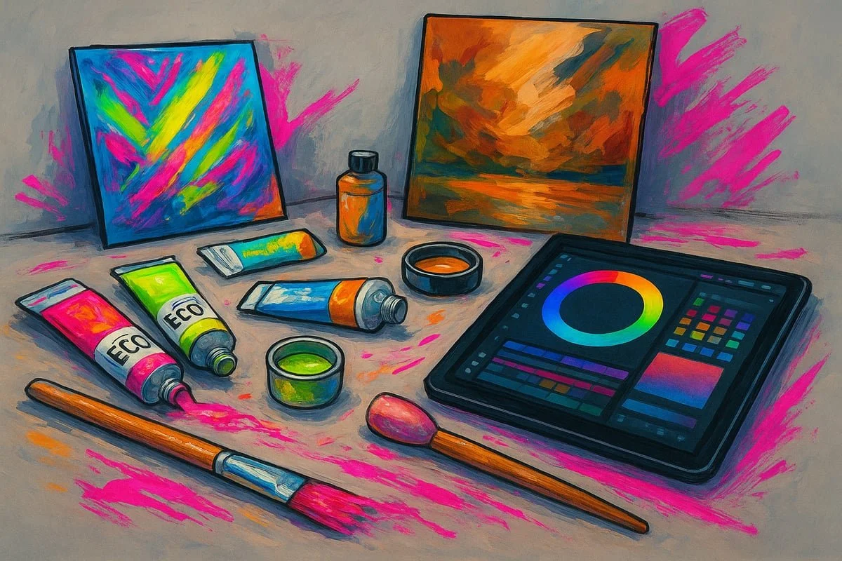
In 2026, the range of available pigments for artists is astonishing. Synthetic breakthroughs have led to new colours with unrivalled brilliance and longevity. Artists can now choose from high-chroma neons, shimmering pearlescents, and crystalline watercolours, each bringing unique effects to the canvas.
Eco-conscious creators are embracing sustainable, plant-based paints and non-toxic alternatives. These options offer vibrant results without compromising the environment. If you love experimenting, you’ll appreciate the increased variety, from mineral-based blues to advanced lightfast reds.
Digital tools also play a major role. Tablets and software allow you to test, mix, and preview colours before even opening a tube of paint. Many artists blend digital and traditional media, creating hybrid works that push boundaries.
Here’s a quick comparison of new pigment types:
Pigment Type Key Feature Typical Use
High-Chroma Synthetic Intense, pure hues Abstract, pop art
Eco-Friendly Non-toxic, sustainable All genres
Pearlescent/Crystalline Shimmer, depth Watercolour, mixed media
The sheer variety of pigment options means that colour for artists is no longer limited by tradition. For a deeper look at the latest pigment innovations, check out the Top 10 Global Pigment Manufacturing Trends 2025. As a result, your palette can be as bold or subtle as you wish, giving you more freedom to express your vision.
Global Influences and Cultural Colour Shifts
The art world is more connected than ever, and this is transforming colour for artists everywhere. International exhibitions, social media, and online platforms expose creatives to a wealth of palettes and styles. Have you noticed how certain hues seem to pop up everywhere, from Tokyo to London?
Trending palettes for 2026 include:
Neon brights inspired by tech and gaming culture
Muted earth tones reflecting environmental awareness
Metallics and iridescents that echo digital aesthetics
You’ll see these colours in works by leading contemporary artists, as well as in major exhibitions. Cultural exchange means traditional meanings are blending, so a colour once associated with calm in one society might now symbolise innovation in another.
These shifts are more than just fashion. They reflect bigger changes in society, like our relationship with technology or the environment. As you explore colour for artists, consider how your influences and audience might shape your choices. Are you drawn to global trends, or do you prefer a personal, local palette?
Adapting to Changing Light and Display Environments
Displaying your work in 2026 means thinking beyond the studio. LED lights, digital screens, and new gallery setups all affect how your colours appear. Have you ever noticed how a vibrant blue on your canvas looks completely different on a phone or under gallery lighting?
To keep your colour for artists consistent and impactful, try these tips:
Test your palette under different lighting conditions before finalising your work.
Use digital previews to see how your art will look online.
Adjust hues and contrast for both print and screen display.
Choose pigments known for stability and lightfastness.
As more art is shared online, many artists now create separate versions optimised for digital and physical viewing. This helps ensure your colours remain true and your impact is never lost, no matter where your audience finds you.
Anticipating how your work will be seen is a key part of mastering colour for artists in 2026. By staying flexible and informed, you can make sure your art shines in every setting.
Practical Colour Mixing: Strategies and Step-by-Step Methods
Unlocking the secrets of colour for artists starts right at your palette. Whether you’re a seasoned painter or just beginning to explore the endless potential of hues, mastering practical mixing transforms your work. Let’s break it down into steps and strategies you can use in your studio today.
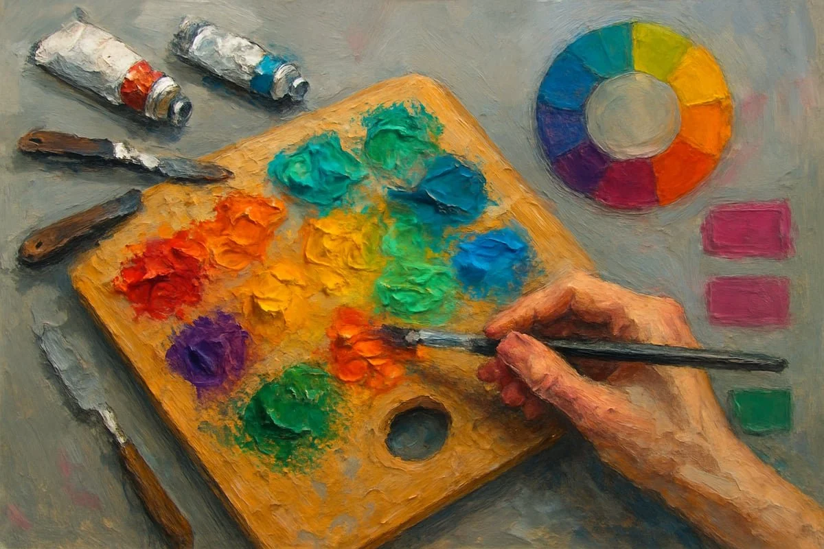
Building a Versatile Artist’s Palette
Choosing the right palette is a game-changer in mastering colour for artists. Your choices set the stage for every painting, influencing mood, harmony, and even your style.
Start by considering the basics. A limited palette, such as the classic Zorn palette (yellow ochre, cadmium red, ivory black, and titanium white), is ideal for portraits and cohesive works. Expanded palettes, on the other hand, offer more options for genres like landscapes or abstracts. The trick is to balance versatility with simplicity.
Here’s a sample setup comparing limited and expanded palettes:
Palette Type Example Pigments Best For
Limited Ultramarine blue, alizarin crimson, cadmium yellow Portraits, still life
Expanded Add phthalo green, burnt sienna, cadmium orange Landscapes, abstract
Always include warm and cool versions of each primary. This helps you mix a wider range of colours without muddy results. For example, try both cadmium red (warm) and alizarin crimson (cool) for reds.
Remember, the right palette for colour for artists isn’t set in stone. Experiment, swap out pigments, and find what works for your creative goals.
Step-by-Step Guide to Mixing Hues Accurately
Ready to dive into the practical side of colour for artists? Let’s walk through a foolproof mixing process.
Start with your primaries: Place equal parts of your chosen red, yellow, and blue on your palette.
Mix secondaries: Combine two primaries to make green, orange, or purple. Adjust ratios for variety.
Create tertiaries: Mix a secondary with a neighbouring primary for subtle hues.
For skin tones, mix a base orange from red and yellow, then neutralise with a tiny amount of blue. Natural greens for landscapes come from yellow and blue, with a touch of red to tone it down. For vibrant purples, use magenta and ultramarine.
Here’s a tip: instead of using pure black, try mixing magenta and viridian for a deep, lively black that keeps your colours fresh.
Keep a notebook of successful recipes. Test your mixes on scrap paper before committing to the canvas. This habit is essential for consistent results in colour for artists.
If you want to see how emotional impact and technical process combine, check out Exploring Colours for Art for real-world examples and inspiration.
Troubleshooting Common Mixing Challenges
Even the most experienced practitioners of colour for artists sometimes hit snags. Muddy colours, flat mixes, and lack of vibrancy are common hurdles—but they’re not unbeatable.
Muddy colours often result from mixing too many pigments or using dirty brushes. Always clean your tools between mixes. If your colours lack vibrancy, try using complementary underpainting to make hues pop. Organise your palette so warm and cool colours stay separate, reducing the risk of dull results.
To neutralise an overly bright colour, add a touch of its complement. For example, if your green is too harsh, a hint of red will soften it. Over-mixing is another trap—stop as soon as you hit the shade you want, or you’ll lose life and clarity.
The beauty of colour for artists lies in the balance between science and intuition. Take notes, observe, and don’t be afraid to adjust your approach as you gain experience.
Advanced Techniques: Glazing, Layering, and Optical Mixing
Once you’ve nailed the basics, advanced techniques open up new dimensions in colour for artists. Glazing involves applying thin, transparent layers of paint over dry sections, building up luminous depth. This is especially effective in oils and acrylics, where the light bounces through layers, creating a glowing effect.
Layering with both transparent and opaque paints helps you control depth and texture. Optical mixing, a favourite in contemporary abstract art, places separate colours side by side. The viewer’s eye blends them, resulting in vibrant, shimmering surfaces.
A classic example is the Renaissance verdaccio underpainting: artists painted a green-grey base for skin, then glazed warm tones on top for lifelike flesh. These methods give you sophisticated control over light, shadow, and atmosphere.
Mastering these techniques in colour for artists brings a new level of richness and complexity to your work. Experiment, observe the results, and let your creativity lead the way.
Selecting and Customising Colour Palettes for Artistic Impact
Choosing the right palette is a powerful way to elevate your art. With so many options in 2026, mastering colour for artists means thinking beyond the basics and shaping your palette to fit your subject, mood, and personal style.
Whether you’re painting a peaceful landscape or a bold abstract, your colour choices set the tone. Let’s explore how you can select and customise palettes for maximum impact.
Tailoring Palettes to Subject and Mood
When you think about colour for artists, the subject matter is the first clue for palette selection. Landscapes often call for a range of greens, blues, and earth tones, while portraits benefit from nuanced skin hues and subtle temperature shifts. Abstracts and still life offer freedom to push boundaries, using unexpected contrasts or harmonious blends.
Here’s a handy table to help you get started:
Genre Recommended Pigments Mood/Effect
Landscape Ultramarine Blue, Yellow Ochre, Sap Green, Burnt Sienna, Titanium White Calm, natural, atmospheric
Portrait Alizarin Crimson, Yellow Ochre, Cerulean Blue, Burnt Umber, Titanium White Warm, lifelike, intimate
Abstract Phthalo Blue, Quinacridone Magenta, Cadmium Yellow, Payne’s Grey, Titanium White Vibrant, energetic, expressive
Still Life Cadmium Red, Viridian, Cobalt Blue, Raw Umber, Titanium White Balanced, contemplative, realistic
Adjusting your palette for lighting or emotional effect is key. For example, muted tones create softness in a portrait, while saturated hues make an outdoor scene pop. Try swapping out one colour at a time to see how it shifts the mood. Remember, the right colour for artists is the one that brings your vision to life.
Creating Cohesive and Dynamic Compositions
Palette harmony is the backbone of strong compositions. Limited palettes—using just a few colours—can unify your work and help avoid clashing or muddy results. Expanded palettes, on the other hand, inject energy and variety, perfect for bold statements.
Consider using analogous colours (next to each other on the wheel) for a serene, cohesive feel. For more drama, reach for complementary pairs like blue and orange to create vibrant focal points. Accent colours are your secret weapon: a single pop of red in a sea of cool tones instantly draws the eye.
Let’s look at a few strategies:
Use a limited palette for portraits to keep skin tones natural and harmonious.
Introduce one accent colour in abstracts to establish a clear focal point.
For landscapes, layer warm and cool greens to add depth and interest.
Case studies from contemporary art show that complementary and analogous palettes are popular for creating unity and movement. Experiment with both to see what works best for the message you want to convey. In colour for artists, balance is everything.
Experimenting with Unconventional and Personalised Palettes
If you want your work to stand out, try breaking the traditional rules. Many leading artists develop their own signature approach to colour for artists, often by experimenting with unusual combinations or custom mixes. This type of play is not just fun—it’s how you find your unique voice.
For inspiration, you might enjoy reading about the Journey Through Colour Process, where personal discovery and technical exploration go hand in hand.
Here are a few exercises to get you started:
Paint a familiar subject using only cool or only warm colours.
Create a “random palette” by pulling three colours blindly and building a piece around them.
Keep a colour journal, noting which mixes excite you and which fall flat.
Remember, every experiment adds to your understanding. The more you play with colour for artists, the more confident and distinctive your work will become.
The Psychology and Emotional Power of Colour
Colour for artists is so much more than a visual choice, it is a powerful tool for storytelling, emotion, and connection. Ever noticed how a painting can make you feel calm, energised, or even nostalgic? That is the magic of colour psychology in action. As you explore the world of colour for artists, understanding these effects can transform the impact of your work.
How Colours Influence Mood and Perception
Every artist knows that colour choices shape the mood of an artwork. Red often signals energy or urgency, while blue can calm the mind and create a sense of peace. Green is linked to growth and renewal, and yellow brings warmth or joy. These psychological effects are not just anecdotal, they are backed by research and widely used in visual storytelling.
When you are selecting a palette, think about the emotional tone you want to set. For instance, using warm colours in a portrait can create intimacy, while cool tones can add distance or mystery. The science behind these associations is fascinating, and if you want to dig deeper, you might enjoy this Color-Emotion Associations Research, which explores how specific hues evoke different feelings for viewers.
If you are looking to maximise the emotional resonance of your work, mastering colour for artists means experimenting with combinations, saturation, and subtle shifts in value. Try making small adjustments and notice how even a slight change can alter the mood entirely.
Colour Symbolism Across Cultures and Contexts
Colour symbolism is not universal, which makes colour for artists a truly global language with many dialects. In some cultures, white is a symbol of purity and new beginnings, while in others it represents mourning or loss. Red might mean luck and celebration in one country, but caution or danger somewhere else.
If your art is meant for an international audience, it is wise to research how your chosen palette might be interpreted. Take blue, for example. In Western cultures, it often stands for calm and trust, yet in some Eastern traditions, it can carry spiritual or even somber associations.
Being aware of these cultural nuances helps you communicate more clearly through your work. For artists who want their message to cross borders, the study of colour for artists must include both personal intuition and cultural research. This approach ensures your art resonates with a wide, diverse audience.
Using Colour to Guide the Viewer’s Eye
One of the most powerful techniques in colour for artists is using contrast and saturation to direct attention. High-contrast areas, such as a bold accent against a muted background, naturally draw the eye. Artists often use complementary colours to create dynamic focal points that stand out from the rest of the piece.
Consider how you can use colour relationships to establish hierarchy. For example, a splash of vibrant orange in a sea of blues will immediately become the centre of interest. You can also experiment with harmonious pairings, as explored in the Harmonious Color Pairings Study, which shows how certain combinations create pleasing, balanced compositions.
Here are a few practical tips for guiding the viewer:
Use saturated colours for focal points.
Balance warm and cool tones to create depth.
Adjust value contrasts to highlight key elements.
By mastering colour for artists, you can transform your compositions, leading the viewer’s journey through your artwork with intention and impact.
Applying Colour Mastery: From Studio to Exhibition
Stepping from the studio into the spotlight, your journey with colour for artists truly comes to life. How do you bring theory into practice and ensure your palette resonates in any setting? Let’s explore how to integrate colour knowledge into every stage, from planning your next masterpiece to presenting it for the world to see.
Integrating Colour Theory into the Creative Process
Colour for artists begins with thoughtful planning. Before you even pick up a brush, consider how your palette will shape the mood and message of your piece. Do you create quick colour studies or swatch cards to test combinations? Many artists use digital previews or physical sketches to see how their choices interact under different lighting.
Try mapping out your scheme early, using the colour wheel as a guide. Will analogous hues create harmony, or do you want the drama of complementary contrasts? Keeping a colour for artists journal helps you track what works best for your subjects. This habit not only sharpens your eye but also builds confidence in your decisions.
Case Studies: Colour in Contemporary Art Practice
Looking at successful examples, you’ll notice how the best artists use colour for artists intentionally. For instance, Spirit Glow Art®’s The Colours of Music collection demonstrates the power of palette selection in evoking rhythm and emotion. Each piece uses vibrant hues and clever contrasts to reflect the energy of sound.
Contemporary abstract painters often layer rich, saturated pigments to build depth and movement. Others might use muted earths for subtlety or neon pops for visual impact. Analysing these approaches helps you see how colour for artists can become a signature style, setting your work apart in exhibitions and online showcases.
Adapting Colour Choices for Different Mediums
Every medium brings its own challenges and opportunities for colour for artists. Oils are prized for their blendability and subtle gradations, while acrylics dry quickly and maintain bright, crisp edges. Watercolours offer transparency and delicate layering, ideal for atmospheric effects.
Digital artists benefit from limitless pigment options and easy adjustments, but must consider how colours translate from screen to print. Here’s a quick comparison:
Medium Colour Strength Unique Qualities Tips for Artists
Oil Strong Slow drying, blendable Use glazing for depth
Acrylic Vivid Fast drying, bold Work quickly, layer opaquely
Watercolour Soft Transparent, light Build up in thin washes
Digital Customisable Unlimited options Calibrate for screen & print
Understanding your medium ensures your colour for artists expertise translates across formats, whether for gallery walls or digital portfolios.
Professional Presentation: Colour in Framing, Printing, and Display
When it’s time to present your work, colour for artists must be protected and showcased. How do you keep your hues true under gallery lights or in print? Always proof your digital files before printing, as colours can shift with different paper types and inks.
For framing, choose mounts and mouldings that complement, not compete with, your palette. LED gallery lights can alter the appearance of certain pigments, so test your work in different lighting. Remember, the way you display art can be just as important as how you create it, especially for colour for artists aiming for professional results.
The Role of Colour in Spirit Glow Art®’s Contemporary Practice
Spirit Glow Art® takes colour for artists to new heights, experimenting boldly with palette choices to evoke emotion and tell stories. In collections like Urban vs Nature colour palettes, contrasting hues highlight the tension between city life and natural landscapes.
Every piece is crafted with intentional colour for artists decisions, from initial sketches to final prints. Feedback from exhibitions often inspires fresh combinations, ensuring the work remains vibrant and relevant. By pushing boundaries and listening to viewers, Spirit Glow Art® shows how colour mastery can connect with audiences on a deep, emotional level.
So, after diving into the world of colour theory, trends, and hands on techniques, you’re probably itching to experiment with some new ideas in your own art, right? I get it—it’s exciting to see how subtle shifts in hue or bold contrasts can totally transform the feel of a piece. If you’re hungry for more inspiration or curious about how contemporary artists are mastering colour in 2026, why not take the next step? There’s a whole spectrum waiting for you. Let’s keep this colourful journey going—Explore now.